I asked my model to pose like this
because I thought it would show the learning aspect of college. The reasons why
I didn’t choose this as my front cover are: it is barely a mid-shot. Therefore
she looks quite small and is almost swallowed in by the surroundings instead of
being the main subject of the image. The second reason was that she was not
looking at the camera and I needed a photo that consisted of a direct gaze. The
photograph also didn’t represent enough of the fun aspect of college.

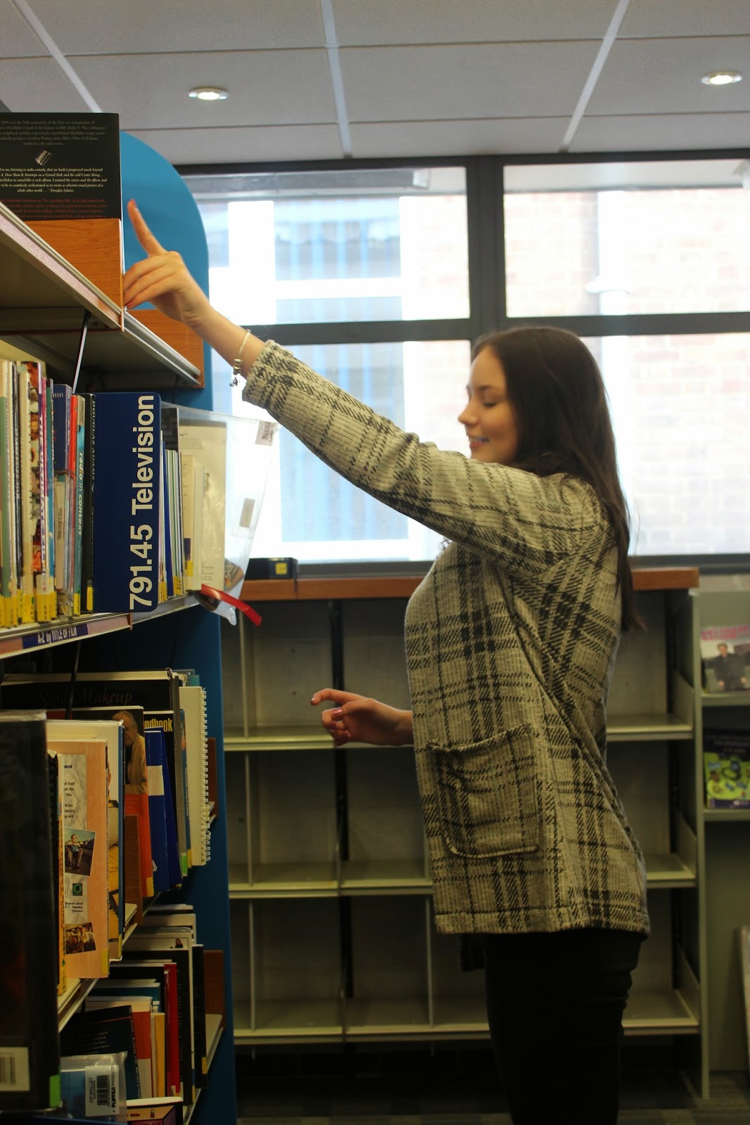
I liked the lighting in this image as
well as the fact that the model was busy reading an educational book. But once
again there was no direct gaze. Another problem with this image was that her
hair was covering the majority of her face. However, I did like the view of her
jacket in this image as one of the articles most wanted in the magazine was
about the latest college fashion.

This image was quite successful as it
shows the model smiling whilst learning. This represents both the educational
and the enjoyable aspects of college. The reason why I did not choose this
image was because there was no direct gaze. The lighting also hid her face
which is an important part of the image because it represents the age of the
stereotypical college student.

I liked the lighting in this image.
It enhanced every aspect of the model as well as what she was doing. Of course
I could not use this image because of the blur on her right hand as well as the
fact that she had an indirect gaze.

This is the image I chose for my
front cover because I liked everything about it. It showed the models outfit to
represent the latest fashion, it showed the model enjoying herself while
learning which represented both the educational as well as enjoyable side of
college. This image also consisted of a direct gaze as well as great lighting.
The only thing I would have to edit is the top of the photograph. I will have
to cut it off so that the model is larger on the front page of my college
magazine.
Good analysis of your photos showing that you are aware of the conventions of front cover images.
ReplyDeleteCan you upload your flatplan to the blog by 3rd Oct please. Thank you.